

Project Details
Working on September began in, well, September. After finishing ASSEMBLING MACHINE, I spent a month trying to find an idea that clicked. I sketched out several ideas, some taking weeks of my time, but after a while, it was clear they weren't going anywhere. They were either too similar to ASSEMBLING MACHINE, lacked possible variations, or I simply didn't enjoy them.

A scrapped project (for now, at least)
I decided to play around with code from Sketchbook Splash, since it had been a while since using the watercolor code I wrote. This was heavily inspired by Tyler Hobbs' watercolor essay (https://tylerxhobbs.com/essays/2017/a-generative-approach-to-simulating-watercolor-paints), and I owe him a lot of credit for developing this technique. I've used this technique of overlaying low-opacity, varying shapes in several projects now.

My starting point, using Sketchbook Splash's code as a foundation
My original plan was to try and emulate this print I've had hanging in my home for a while.
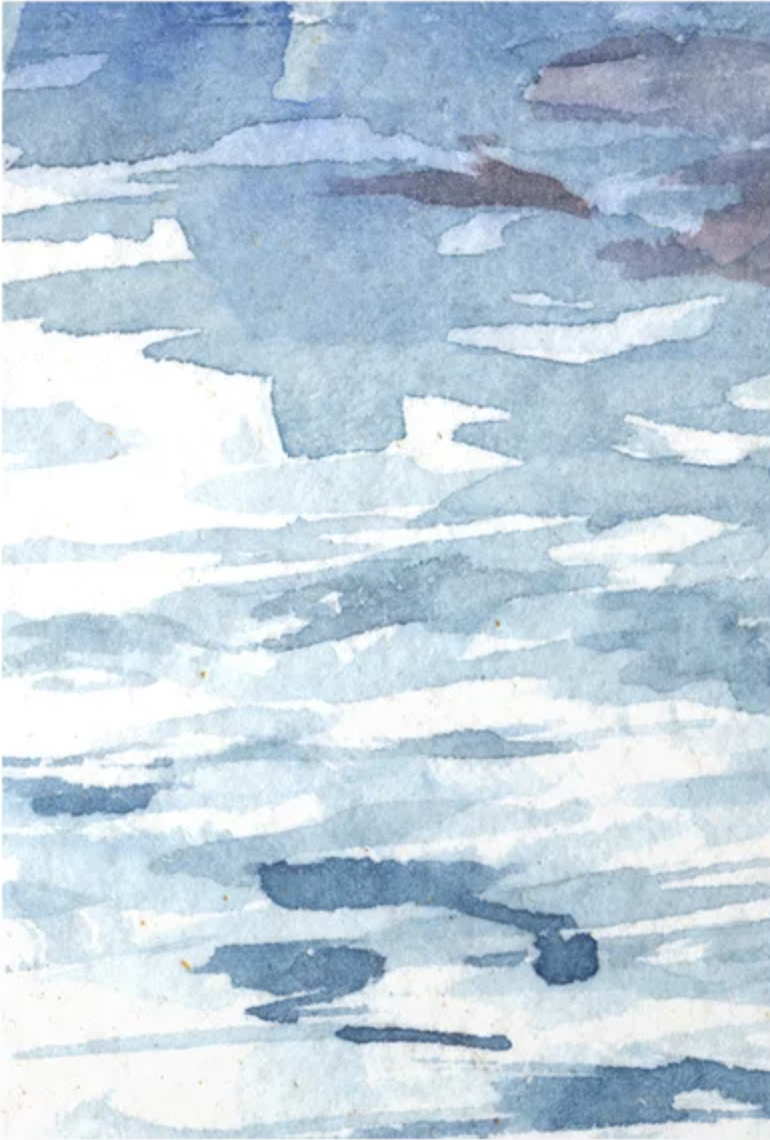
Watercolor 03 - ARau (purchased from Society6)
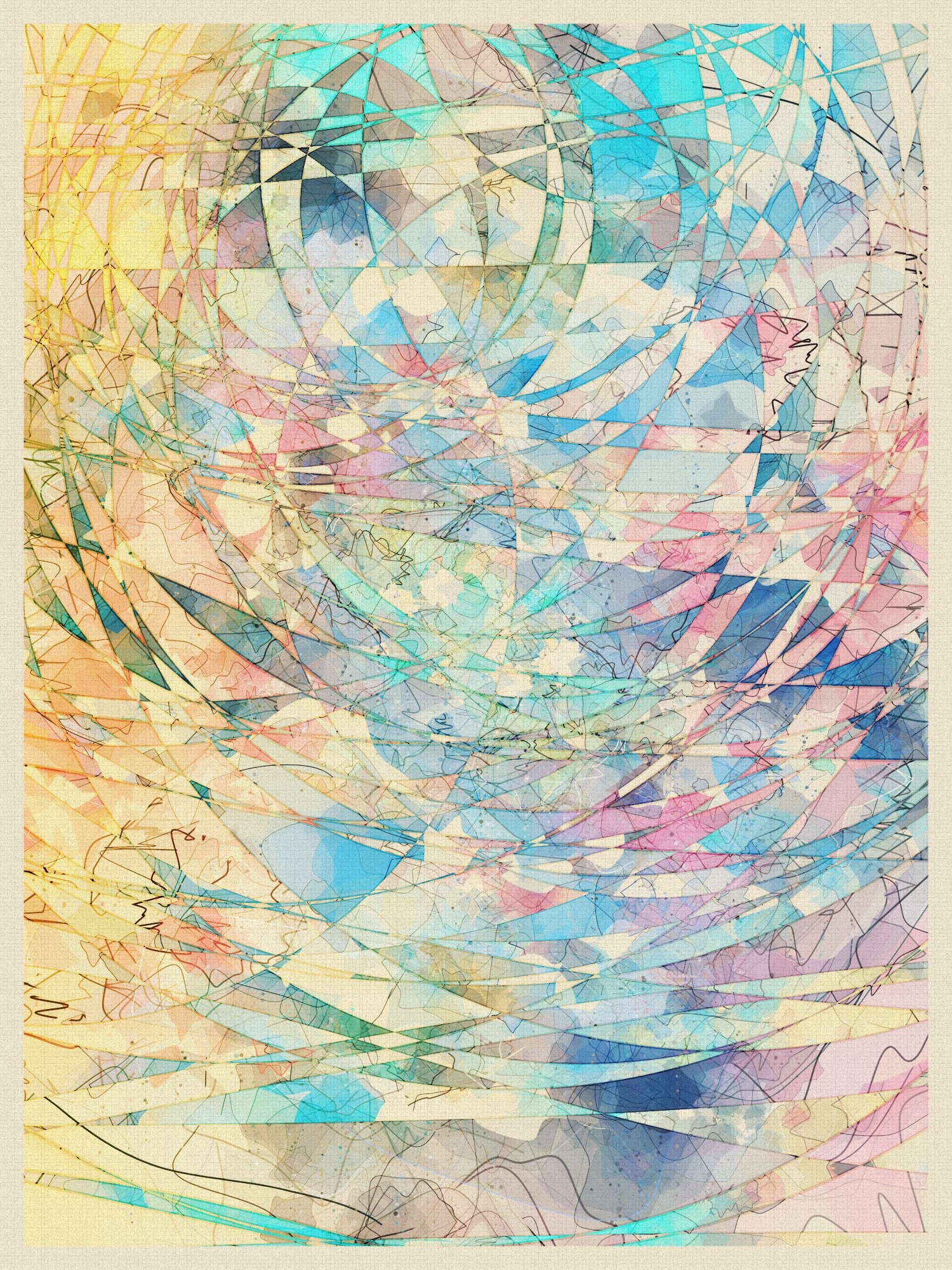
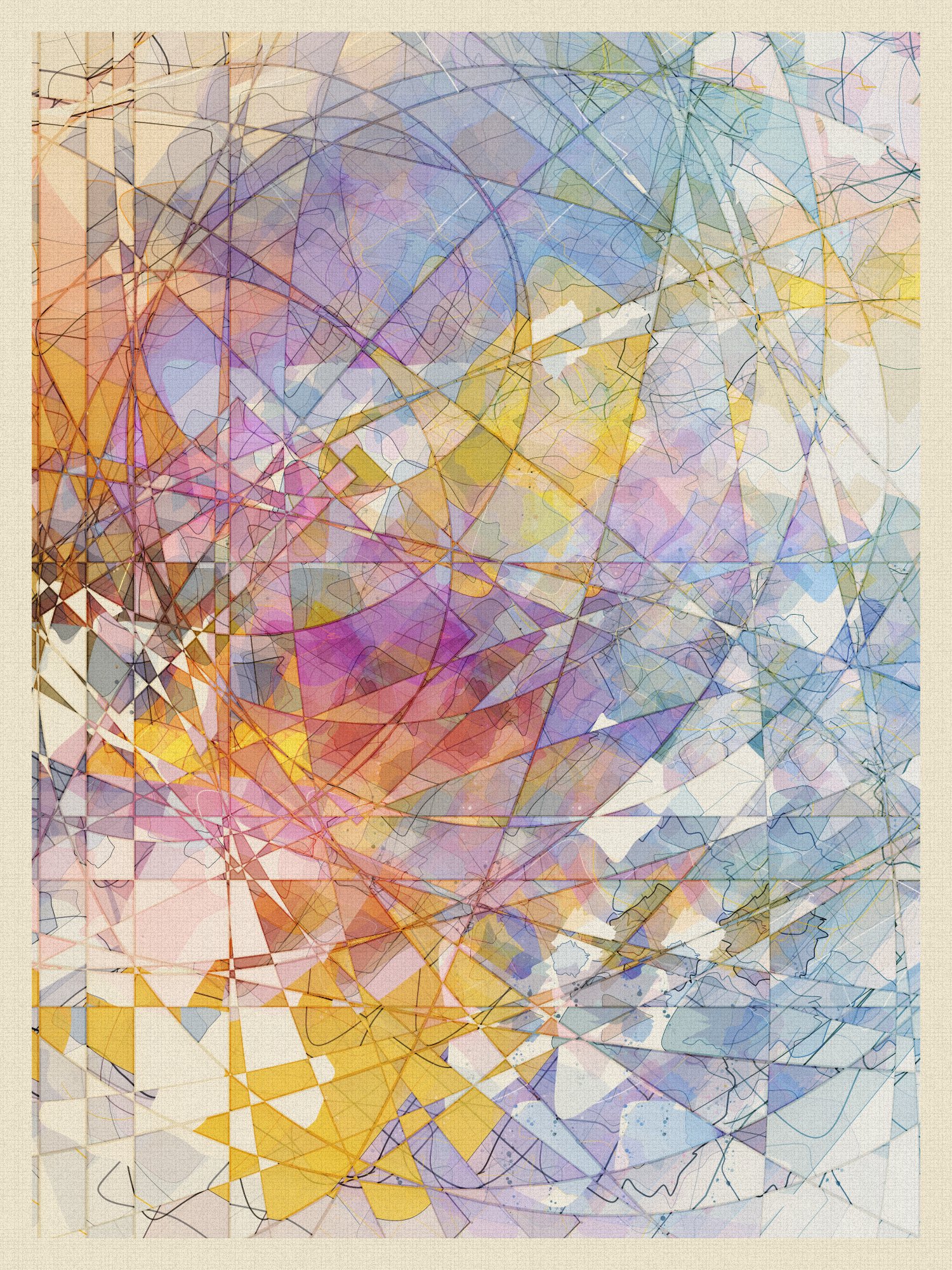
My previous watercolor attempts used large, almost canvas sized shapes blended together. Instead, I wanted to use smaller, more intentionally shaped "brushstrokes", and use more negative space.

These results were okay, but weren't fully drawing me in, so I got the idea to clip parts of the canvas using basic shapes. Instead of just clipping with a plain background, like I did in Sketchbook Splash, I decided to clip the watercolors, and then use a flipped version of the original watercolors as a background. This idea really clicked for me, and at this point I knew I'd be sticking with this project.
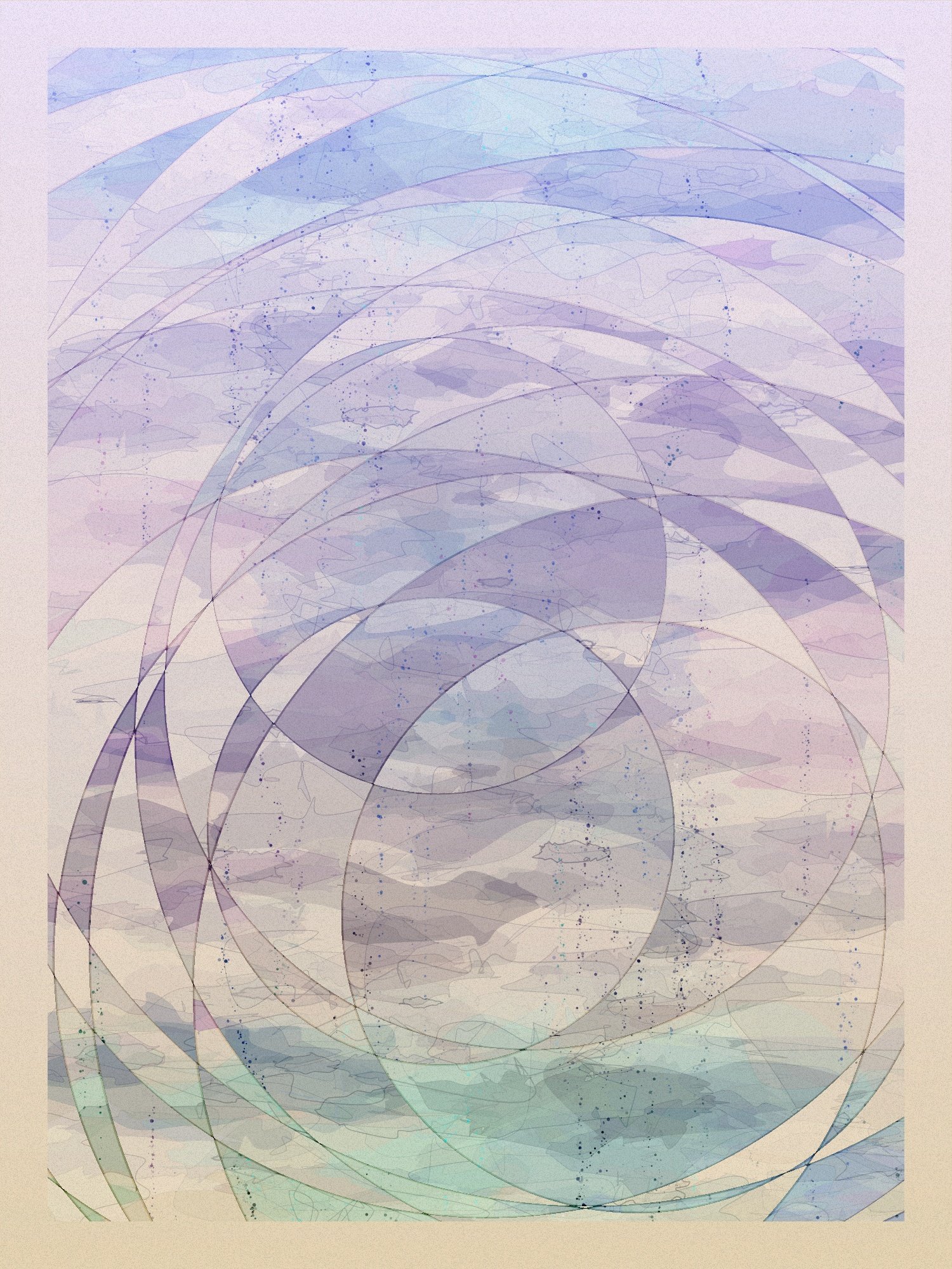
A first attempt at clipping using overlapping basic shapes, and flipping the original watercolors
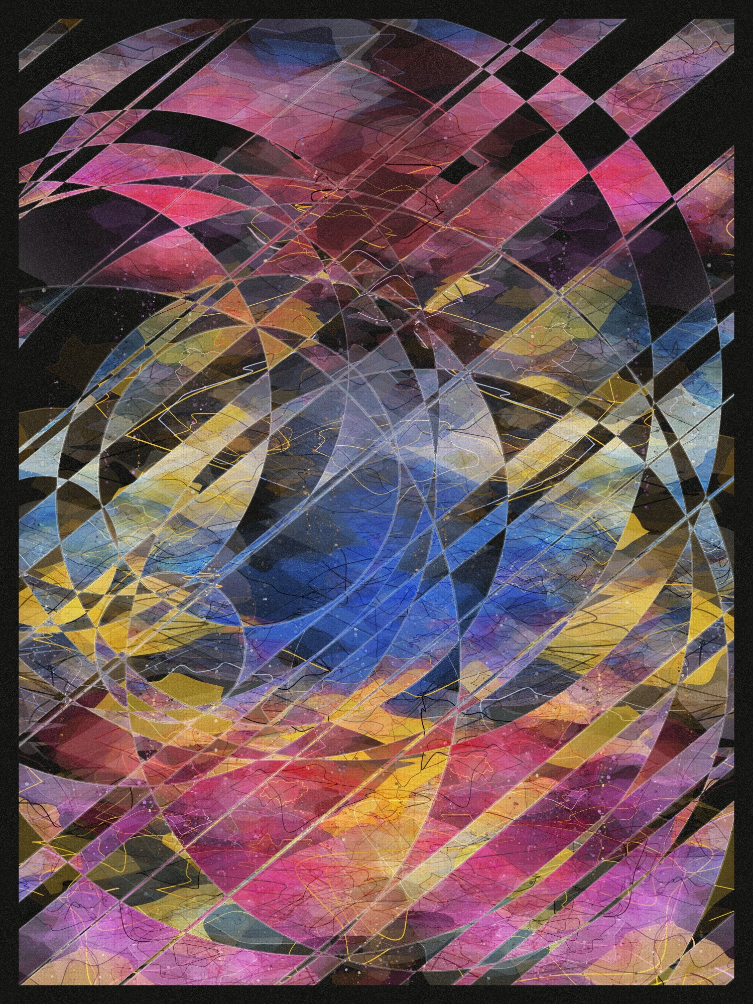
Maybe other generative artists know this feeling; once I have the base logic of a project down, everything else comes naturally, but takes a long time to get right. Lots of tweaking values, probabilities, colors, and tiny details. Making one output out of 100 that I like is usually easy, but making each output at least "good" to me is challenging and often tedious. It's a delicate balance of leaving outcomes to chance, and constraining randomness of how different variables can interact with each other.

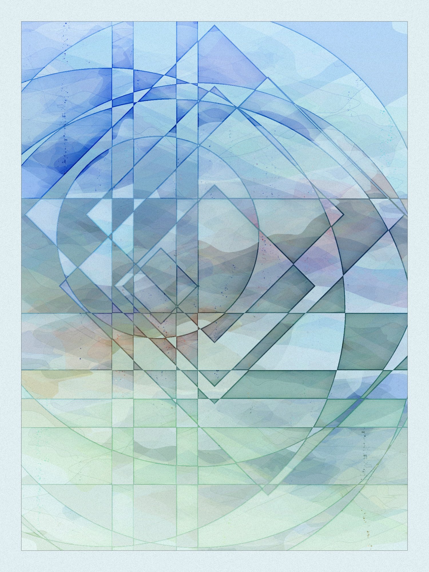
At this point, I was pretty happy with my results, but I knew it still needed a lot of work for smaller details and to be more consistent between outputs. Things like the canvas texture, how watercolor shapes are sized, placed, and outlined, how colors blend together, adding more variation to the cutout shapes; all of these needed lots of tinkering. While I liked the smooth, blended look of the watercolors, I wanted finer details in the final product, alongside some more intentional composition.

Once my changes no longer improve the average output, I know I should stop writing code. It can be hard to know when it's okay to stop, especially if some outputs aren't my favorite. Often, though, I find that the outputs that I don't love are the ones that others do. It's hard to remember that everyone has their own taste, and nobody will love 100% of the outputs. If I'm too restrictive in the outputs, the ones I like become too common, and they lose their uniqueness.
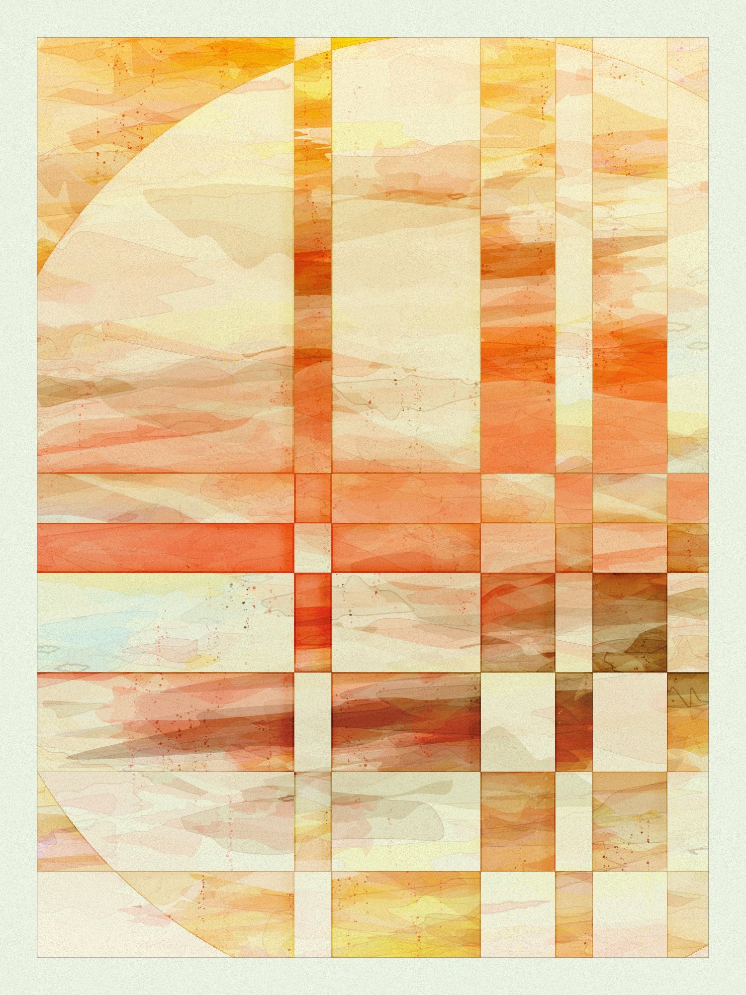
I also spent time adding some less common features, like varying shape stroke colors and some alternative background colors.

I hope you enjoyed some background behind this project, and the final outputs themselves!